Whether you work with designers, vacation rental owners, or real estate agents, you’re bound to come across tiny rooms to photograph. Hall baths, laundry rooms, pantries… photographing a small room can be difficult! There are things you can do to make sure you get a photo that minimizes distortion and shows a small space in the best possible way. Let’s dig in to the top 3 tips for photographing small spaces.
Step back.
If you remember nothing else, remember this tip: step back. When I say to step back, this means you can step outside of the room, too! As long as you’re not seeing door frames and you can still see the major elements, then you’re okay to step outside the room. Stepping outside the room also gives you the freedom to zoom in a bit, helping to reduce the lens distortion.
If you’re working with a real estate agent, you can still use this tip, but choose to include more of the room. For real estate photography you do typically need to be able to show more of the room at once. Make sure you show enough of the room to give a sense of the layout and show each fixture.
Finally, don’t be afraid to show a little bit of the door! You don’t want to see a huge door in the foreground, but seeing a bit of the door edge and handle can add a lifestyle vibe that makes the image stand out.
Remove items from the styling.
With small spaces, a few things can make a big impact. So it makes sense then that having small items scattered throughout could make the space feel busy and unappealing in the photo! Often a pare down to a few very purposeful styling pieces can make a huge difference. Items like trash bins, tissue boxes, and cleaning supplies can often be found in this room but should be taken out. Pay attention to the floors as well! Most designers will not have small area rugs, but if you happen to come across one then consider removing it. Anything that breaks up the floor will just add to that visual clutter.
Don’t capture it all.
Especially when you come from a background of real estate photography, you may feel a tendency to want to show as much of the room as possible. Resist the urge! It’s better to show beautiful sections of the room and potentially have multiple photos, than it is to show a super wide photo that shows everything in a not-so-great light. Think about the spots where the room has the most human interaction to find the areas that you could focus in on. In a bathroom, you may show the vanity area with just a peek of the toilet or tub beyond. In a laundry room you may show the cabinetry and folding area with a corner of the washing machine showing.
Take a look at the sample photos below to see some of these tips in action.
(these photos have all had the exact same edits done)
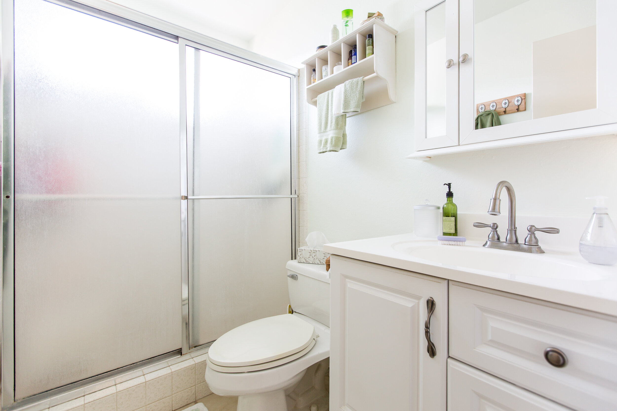
This photo is acceptable for real estate, but too wide for designers. There’s no need to see the entire shower door, the items in the shower distract, and the decor feels a little cluttered.
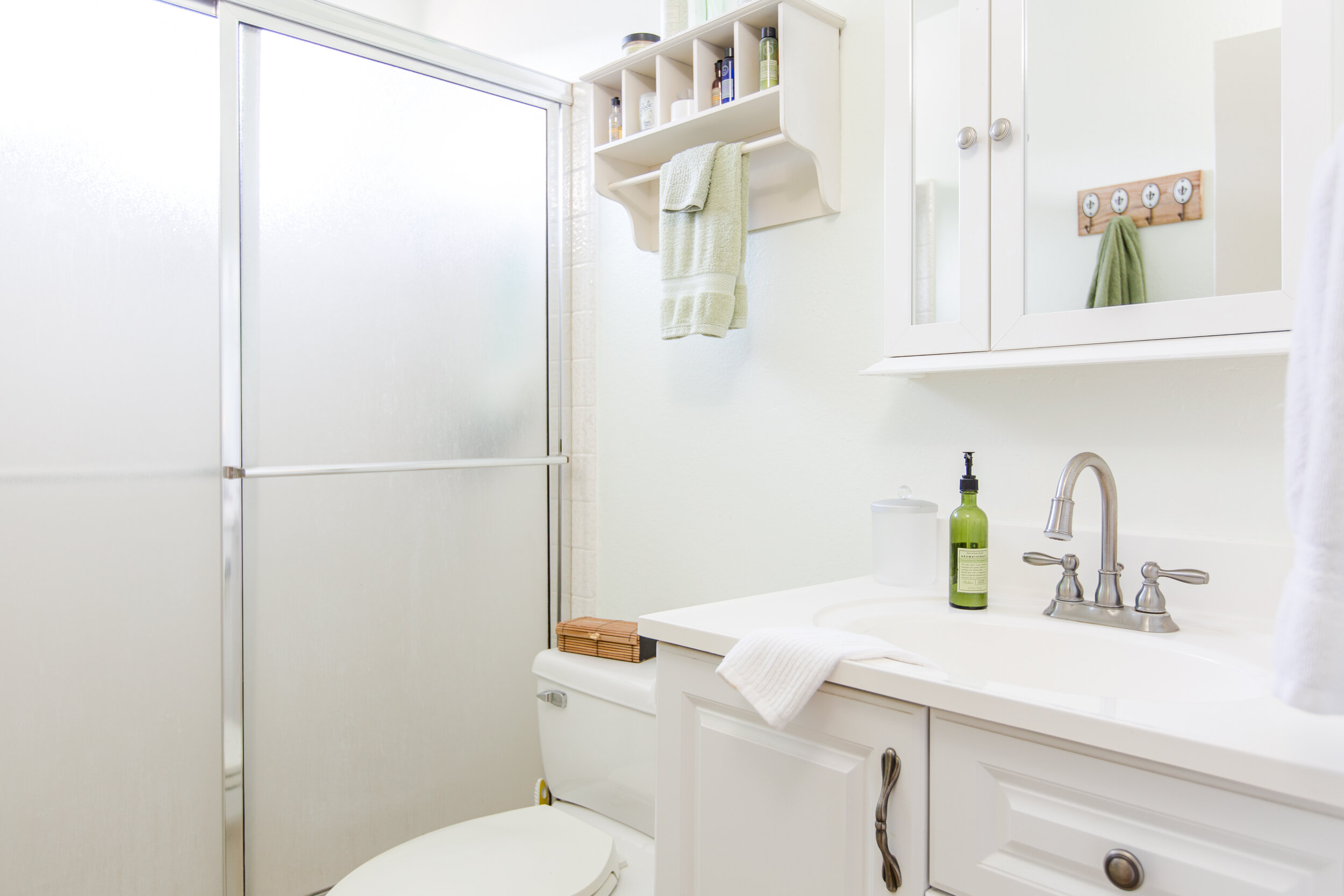
This shot is tighter, showing the layout but focusing on the vanity area. We cleaned up the styling by taking out the tissue box, removing the clear soap dispenser, simplifying the small towels handing, adding a small towel draped over the front of the sink, and removing a small brush on the sink. We also removed the pink item in the shower, but forgot to remove one green pouf on the right side of the shower (whoops!).
How about we try a vertical shot of the same bathroom?
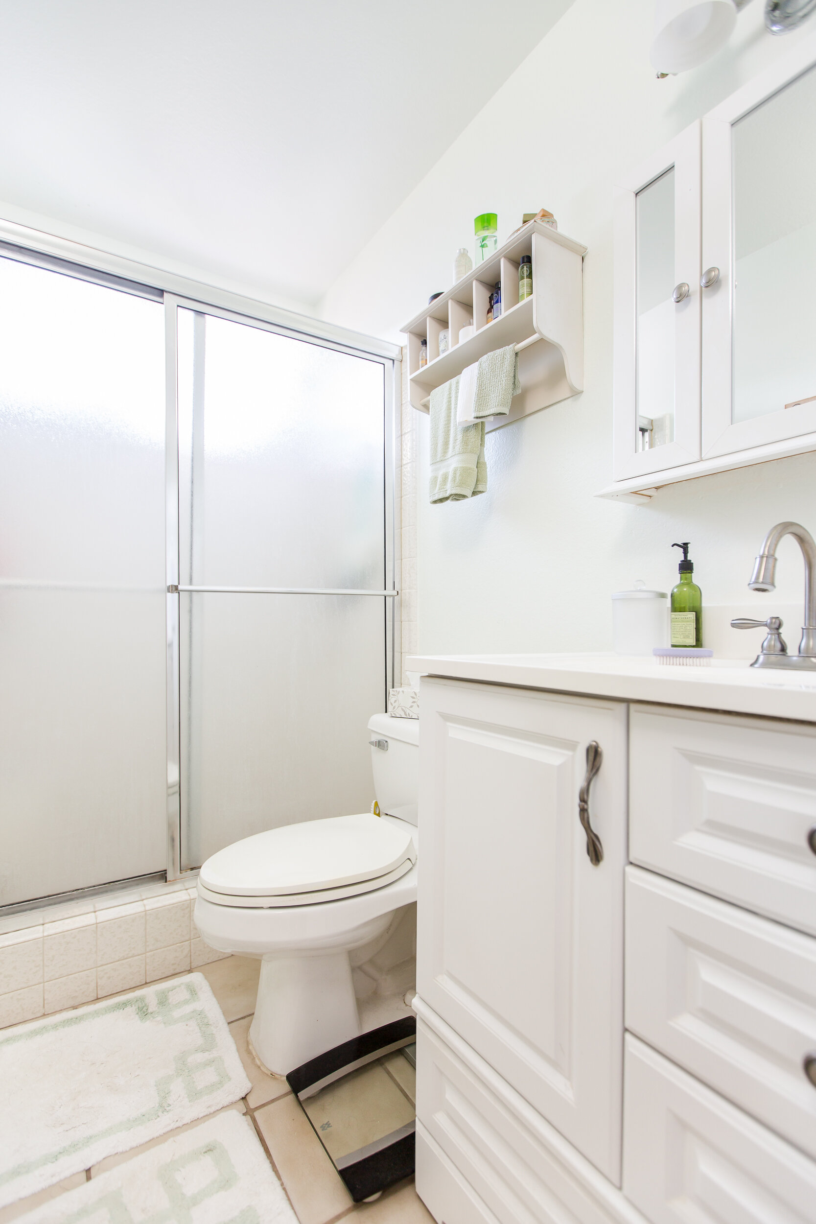
This is your typical wide shot, fine for real estate. A bit low, but it captures the layout and all the fixtures. The scale is super distracting and you do see the two small rugs that break up that floor, making it look really busy.
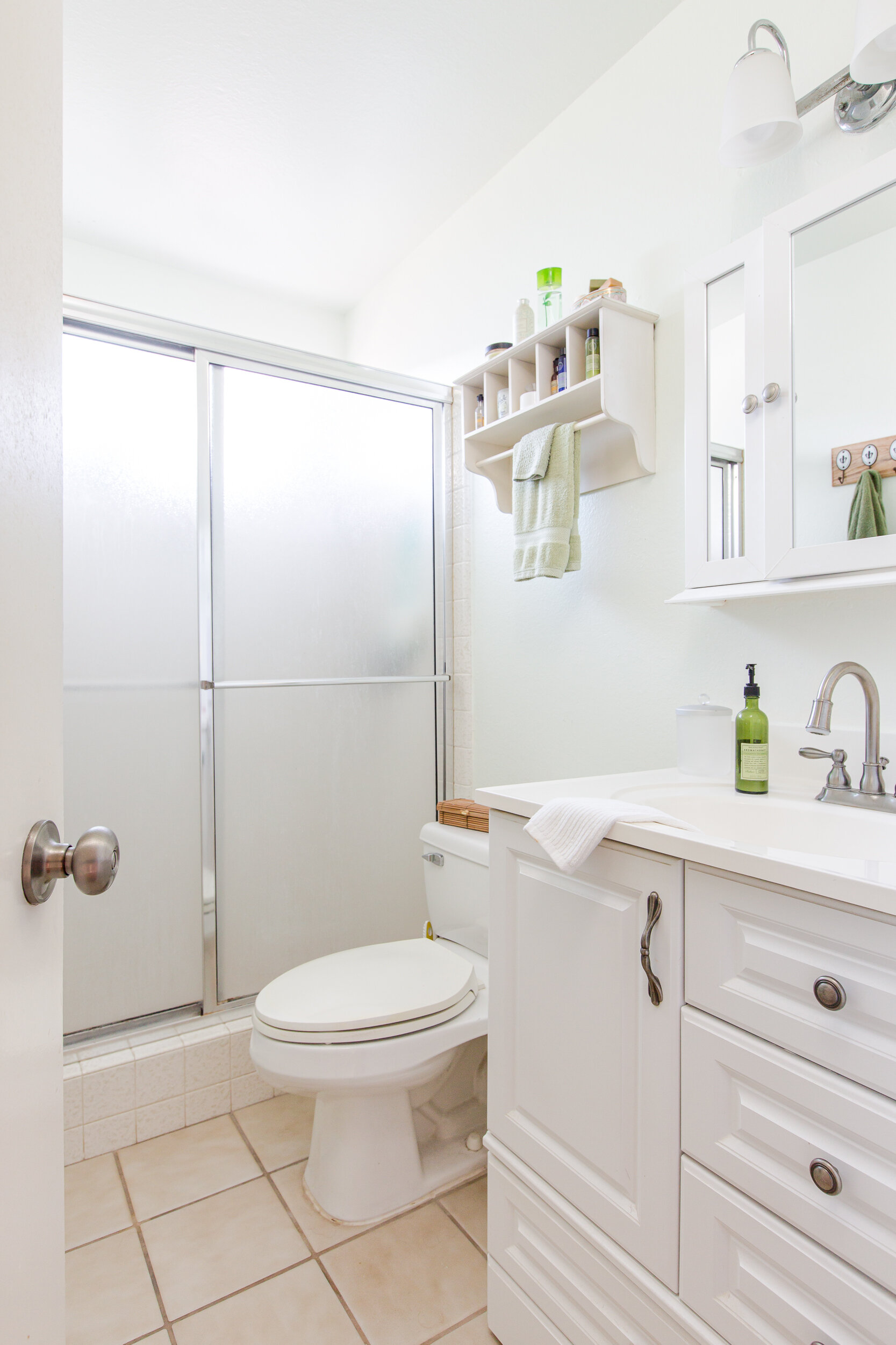
Here you can really see the difference that cleaning up the styling can make! The floor rugs are gone, we took out the tissue box, removed the scale, added a small towel in front of the sink, removed the purple brush at the sink, and readjusted the small green towels. We also ever-so-slightly opened one of the cabinet doors to show the reflection of the towel hooks on the facing wall (otherwise hidden from view). We’re also showing a little bit of the door, which can add a lifestyle touch to the photo.
There wasn’t a huge change in camera position for these because the wall layout didn’t allow for it, but below are behind-the-scene looks at each camera position.
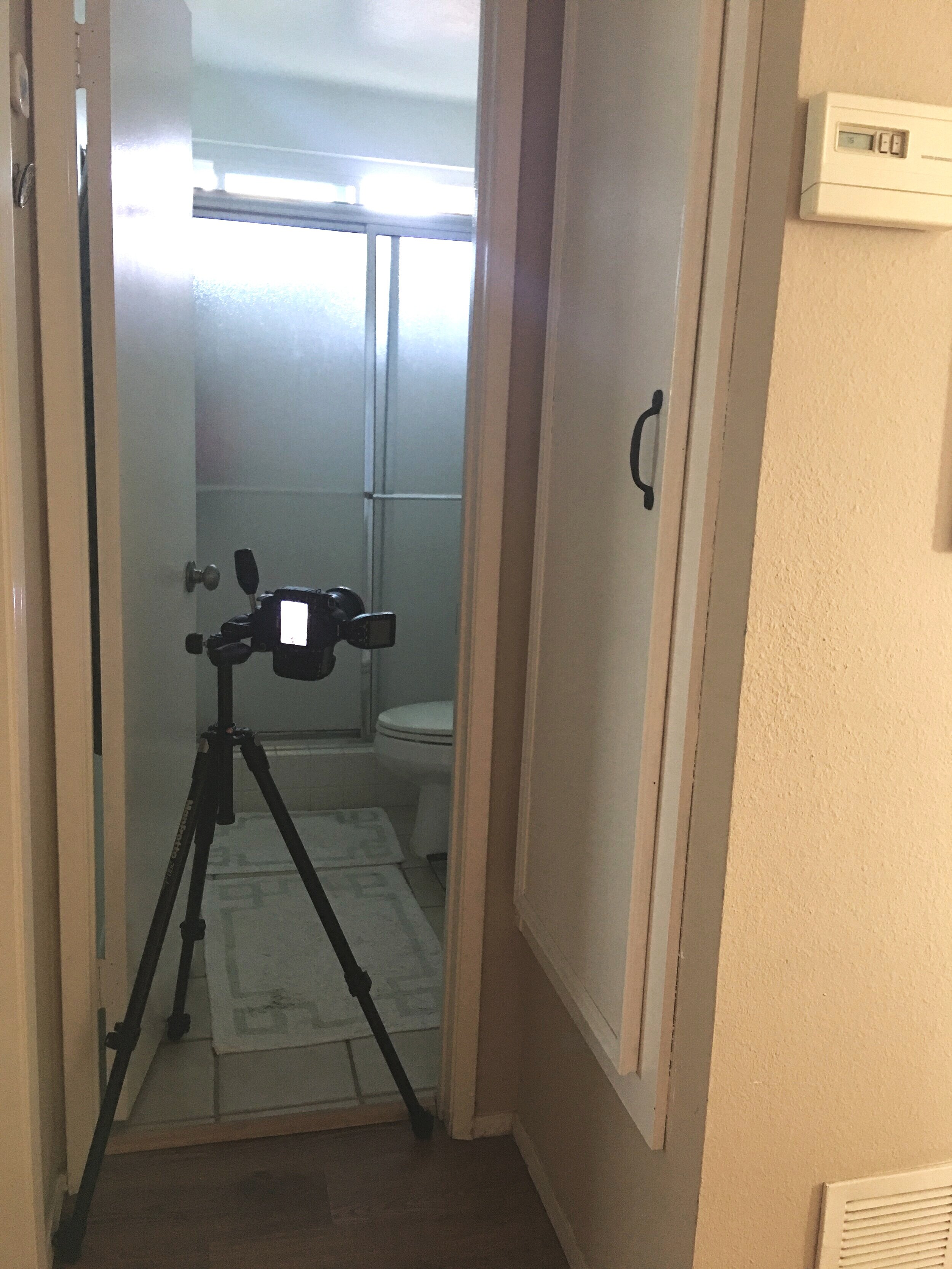
This is the camera position for the wider shots. The camera was right over the threshold, but quite close to the vanity.

By adjusting one of the tripod legs, the camera can get closer to the wall. This keeps it near the threshold, where it needs to be so it can show the faucet, but allows it to be farther away from the vanity - the main focal point in the bathroom. You can also see the items I took out from the bathroom sitting in the hallway (great shower cap, right?!).
Small spaces are tough to photograph, but with some extra tripod maneuvers, pared down styling, and intentional compositions you can master any small space! Remember that small spaces are very impacted by small changes. Take a few extra minutes to consider what your next small space needs to step it up a notch.
xo


